Request Form Examples
•AutoFill Employee Address Information
•Specifying Control Visibility
•Specifying a Unique ID for a Control
•Specifying a Field Type (Text or Number) and Numeric Constraints
•Specifying Response Value Boundaries
•Adding a Dividing Line Between Sections
•Displaying Categories on Separate Form Pages
•Allowing Users to Attach Files
AutoFill Employee Address Information
This example illustrates the use of default values to auto-fill address information for an employee using values that reference the employee business object from a validation list.
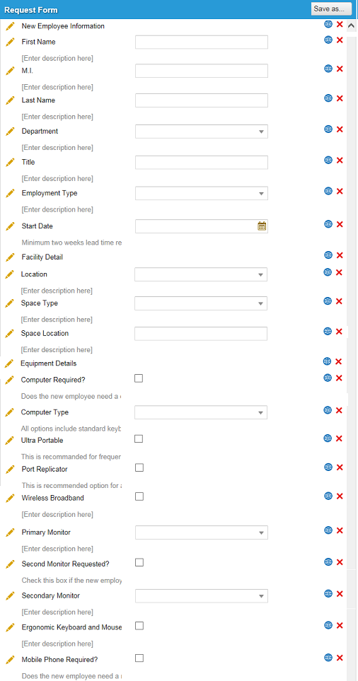
1.Create a request form with employee address information that includes the following fields:
•A drop-down list control to select an employee name from a pick list.
•A text field that shows the email address of the selected employee.
•A text field that shows the street address of the selected employee.
•A text field that shows the city of the selected employee.
•A text field that shows the state of the selected employee.
Address Change Request Form
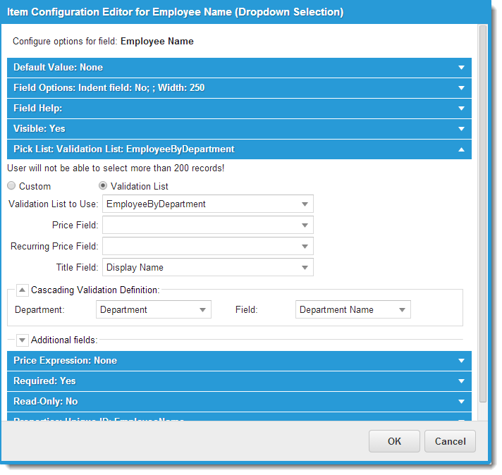
2.Click the edit icon  next to the Employee Name control. The Item Configuration Editor appears.
3.Expand Pick List, then enter your parameters.
Sample Employee Validation List
| Field | Description |
|---|---|
| Validation List | Check this option. |
| Validation List to Use | Choose Employees or EmployeeByDepartment from the drop-down list. |
| Title Field | Choose Display Name from the drop-down list. |
| Under Cascading Validation Definition | |
| Department | Choose Department from the drop-down list. |
| Field | Choose Department Name from the drop-down list. |
Leave the other fields as is.
4.Click OK. The window closes.
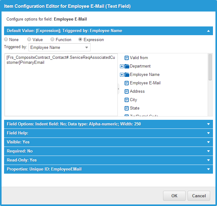
5.Click the edit icon next to the Employee Email control. The Item Configuration Editor appears.
6.Expand Default Value, then enter your parameters.
Sample Email Employee Edit
| Field | Description |
|---|---|
| Expression | Check this option. |
| Triggered by | Choose Employee Name from the drop-down list. |
| Expression field |
Enter the following into this field: [Frs_CompositeContract_Contact#.ServiceReqAssociatedCustomer]PrimaryEmail |
7.Click OK. The window closes.
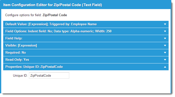
8.Repeat the last procedure to configure the remaining text controls:
•Address
•City
•State
You may want to set the text controls as read-only so that the default values cannot be overwritten.
When you create a record from the Service Catalog and specify the employee name, the address information is automatically filled in.
Specifying Control Visibility
You can specify whether a control is visible all of the time, none of the time, or part of the time based on an expression.
You can specify that a field is not visible when you do not require user input, but you need to use the field for workflow fulfillment.
1.Within the Item Configuration Editor, expand the Visible area.
2.Choose an option.
| Option | Description |
|---|---|
| Yes | The field is always visible. |
| No | The field is never visible (that is, it is not used on the form). This setting is typically used for test or temporary fields that should not be shown to end users. |
| Expression |
Enter an expression or choose an object from the field list to use as the basis for dynamically setting visibility. For example, to use the Computer Type field of the current form to control whether the current control is visible, navigate to This Form > Computer Type in the navigation area and double-click Computer Type. Edit the resulting expression so that it evaluates to true or false as necessary for your requirements. The control is visible when the expression evaluates to true. See About Expressions for more information. |
3.Click OK. The window closes.
Specifying a Unique ID for a Control
To specify a unique ID for a control so that the control can be referenced programmatically, within the Item Configuration Editor, expand the Properties area and enter a unique ID in the Unique ID field. Click OK.
Sample Unique ID
The application automatically generates a unique ID for all form controls. The configuration described here changes the generated value to a value of your choice. Any values that you specify must be unique within the request form.
Making a Control Read-Only
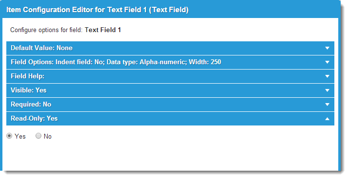
To make a control read-only, within the Item Configuration Editor, expand the Read-Only area and select Yes. Click OK.
Read-Only Option
This control is often used with a default value based on an expression. For example, you can configure a control as follows so that it is read-only and contains the cost center information for a user by default:
•Control type: Text field
•Read-Only: Yes
•Default Value: Expression
•Triggered by: a drop-down list field called recipient
•Expression: $([Profile#Employee.]CostCentre)
Specify a Required Field
You can specify whether a field enforces required input always, never, or sometimes based on an expression.
1.Within the Item Configuration Editor, expand the Required area.
2.Choose an option.
| Option | Description |
|---|---|
| Yes | The field is always required. |
| No | The field is never required. |
| Expression |
Enter an expression or choose an object from the field list to use as the basis for dynamically setting requirements. See About Expressions for more information. |
3.Click OK. The window closes.
Specifying a Field Type (Text or Number) and Numeric Constraints
When you use the text, number, or money field control, you must specify whether the field data type is alpha-numeric, numeric only, or money. For numeric fields, you can optionally set upper and lower boundaries for responses. You can also create a custom "mask". (For example, to create a post code for another country such as W11 2BQ, enter A00 0AA).
1.Within the Item Configuration Editor for a text, number, or mask control, expand the Field Options area.
Field Type Control
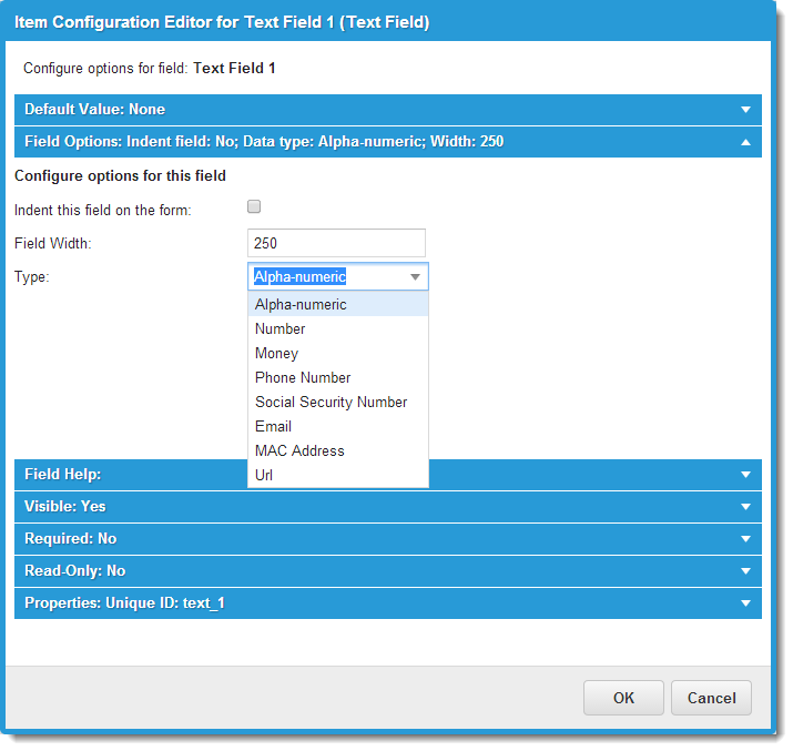
2.Choose an option from the Type drop-down list.
| Option | Description |
|---|---|
| Alpha-numeric | Select for text fields. |
| Number |
Select for generic number fields. For Enter minimum and maximum value constraints for this field, enter numbers to constrain the Minimum and Maximum field response values with the following results: The value entered in the Minimum field is displayed as the default value. A value is now required and must be entered by a user (or the default value is used). The value entered must conform to and fall within the settings defined by the Minimum and Maximum fields. |
| Money | Select for fields containing currency values. The Min and Max fields appear. Enter numbers to constrain response values (optional). |
| Phone Number | Select to automatically format numbers to phone numbers, such as +1-408-555-1212. |
| Social Security Number | Select to automatically format numbers to social security numbers, such as 123-45-6789 |
| Select to allow users to enter an email address, such as [email protected] | |
| MAC Address | Select to allow users to enter a MAC address, such as 00:1C:B3:09:85:15. |
| URL | Select to allow users to enter a URL address, such as http://www.ivanti.com. |
3.Click OK. The window closes.
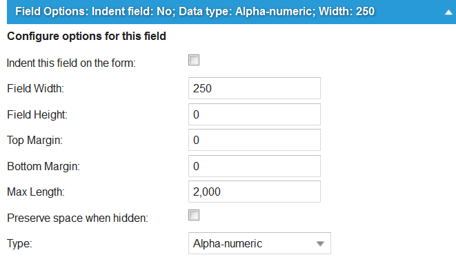
Specifying Field Dimensions
To specify the field width, and maximum number of characters allowed in character-based fields:
1.Within the Item Configuration Editor, expand the Field Options area.
2.In the Field Width field, specify a maximum width for the field in pixels.
3.In the Max Length field, set a character value up to 3000. In some cases the maximum number of characters will depend on the field for which this limit is specified, and the field width that was set.
4.Some controls (such as text area) also let you specify a maximum field height (measured in characters). If a Field Height field displays, specify a maximum character value between 50 and 3000. The application warns the user when the number of characters entered in the text field exceeds the specified settings.
5.Some controls allow you to specify the type of characters that can be entered. Select from the choices available in the list.
Field Options - Text Area Control
6.Click OK. The window closes.
Specifying Response Value Boundaries
To set upper and lower boundaries for date, time, DateTime, and text, money, and mask fields:
1.Within the item Configuration Editor of a date, time, DateTime, text, money, or mask field, expand the Field Options area.
Sample Date Control Boundaries
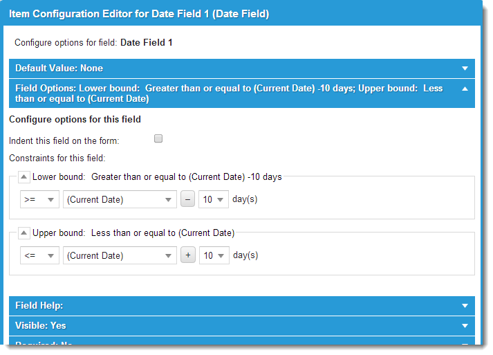
2.Expand the Lower bound area.
3.In the first field, select None to specify no boundary or >= to set a lower boundary.
If you specified >= in the first field, go to the second field and select a value. Items in parentheses are date and time functions. Items not in parentheses are other fields on the form. Other fields are displayed only if they match the current field type. For example, if a date field is being configured, only other date fields are included in the list.
For DateTime fields only, you can specify the time component for a range. For date fields and time fields, you can set only date and time, respectively.
4.Repeat for the Upper bound area.
5.Click OK. The window closes.
Adding a Dividing Line Between Sections
To insert a dividing line beneath a category heading:
1.Within the item Configuration Editor for a category heading control, expand the Field Options area.
Sample Category Heading Control
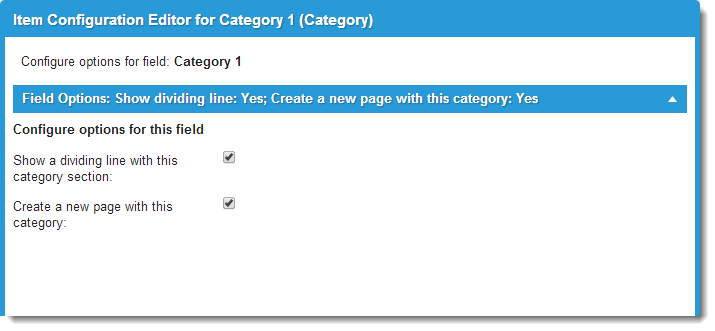
2.Check Show a dividing line with this category section.
3.Click OK. The window closes.
Displaying Categories on Separate Form Pages
To view a category within its own page in a form, check Create a new page with the category, then click OK.
A request form with navigation controls is created.
Indenting a Field
To indent a field, within the item Configuration Editor, expand the Field Options area, and check Indent this field on the form. Click OK.
Allowing Users to Attach Files
To provide a form control that allows users to attach files when filling out a Service Catalog form:
1.Within the item Configuration Editor of an Upload attachments control, expand the Field Options area.
Upload Attachments Control
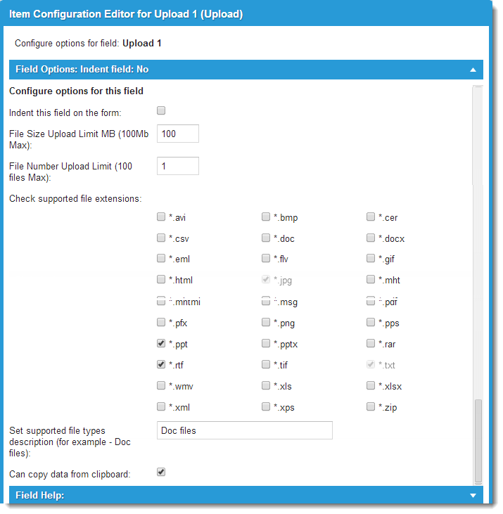
2.Specify the maximum attachment file size, number of files, and allowed file types.
3.Optional. Enter a description to show in the form.
4.To allow pasting attachments from the clipboard, check Can copy data from clipboard.
Depending on how you configure the control, it will be similar when shown in a Service Catalog form.
|
Control |
Configurable Items |
|
Category Heading |
Adds a dividing line. Displays the category on a separate form page (that is, create a multi-page form). |
|
Check Box |
Adds a default value. Adds a price. Sets the visibility of the control (that is, make the control visible or invisible based on certain conditions). Requires a response. Makes the control read-only. |
|
Adds a default value. Specifies numeric or alphanumeric response data type. Sets the visibility of the control. Requires a response. Makes the control read-only. |
|
|
Text Area |
Adds a default value. Sets the visibility of the control. Requires a response. Makes the control read-only. |
|
drop-down List |
Adds a default value. Adds a pick list. Sets the visibility of the control. Requires a response. Makes the control read-only. |
|
Date Field |
Adds a default value. Adds upper and lower value boundaries. Sets the visibility of the control. Requires a response. Makes the control read-only. |
|
DateTime Field |
Adds a default value. Adds upper and lower value boundaries. Sets the visibility of the control. Requires a response. Makes the control read-only. |
|
Time Field |
Adds a default value. Adds upper and lower value boundaries. Sets the visibility of the control. Requires a response. Makes the control read-only. |
|
Image |
Selects the image file. To make an image file available for selection, you must first upload it as an attachment through the Attachments tab in the Form Designer Tools pane. Specifies image size. Adds a border. Sets the visibility of the control. Requires a response. Makes the control read-only. |
5.Optional. To change to a two- or three-column layout, click Choose a style and select a new layout. By default, forms use a single-column layout.
6.After completing a draft of the form, click Preview to see how it will look when a user in the Self-Service Portal opens it in the Service Catalog.
7.To make further changes, repeat any of the steps in this section.
8.Click Next or click the Plan Request Fulfillment tab to go to configuring the request offering.